This screenshot shows me doing the first part of editing the credits. This part involved me choosing what the credits will say in the thriller. To help me complete this I used http://en.wikipedia.org/wiki/Opening_credits. I used this website because it showed me the different credits which I could include in my thriller and what order to place them in and I did this so that my thriller was convention and also so that it looks professional. I decided that the first title in our thriller will read 'A f
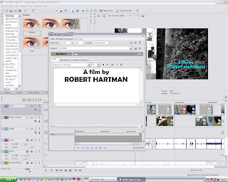 ilm by Robert Hartman'. I have chosen this title first because it shows who the film was created by which is normally the first title in the title sequence. We also decided as a group that it would be better to make up sensible names rather than using our real names. As you can see in the screenshot, this part of the editing involved me changing the font, font size and whether to have it in bold and italics. I decided on the font Berin Sans FB Dami and this is because it is easy to read and looks smart. I also decided to have the font size of 26 so that it isn't too small but it also isn't too big and it is easy to read. I then decided that it would be effective if the titles were in bold because it makes them stand out more. This part of the editing also gave me the option to edit the alignment of the text and I thought it would be more appropriate to have the text in the middle. I had to do this editing for each title that I was included in our thriller such as the production company, the director and the title of the thriller etc.
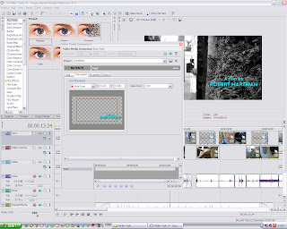 This screenshot shows me doing the next part of the editing for the credits. This part involved me choosing the placement of the credits. This meant that I could choose where to place each title in the shot. I believe that I chose a suitable placement for each title so that it looked effective, noticeable and also flowing with the rest of the thriller. However this part of the editing was more difficult than it looks because I am a bit of a perfectionist and I wanted to have the titles in the perfect position which meant that it took me a little while to complete this because I was able to place the credits anywhere on the shot.
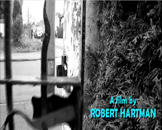
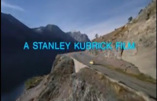
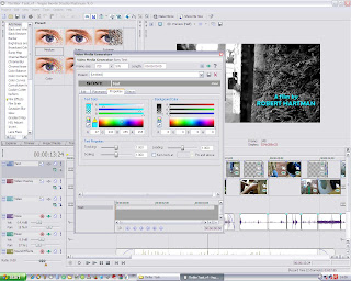 This screenshot shows me doing the final part of editing the credits. This part involved me changing the colour of the titles. This part probably would have taken me ages to complete because of the wide variety of different colours to choose from. However I already had an idea of what colour I wanted the titles to be. Although I slightly knew what I wanted to do this part of the editing probably was still the most time consuming because I wanted to make sure that I used a suitable colour which also looked professional. As I have previously mentioned, 'The Shining' inspired me when it came to creating the credits. This is because I enjoyed the colour of the credits which were used in the opening sequence of the film and thought it would be an extremely good idea to use a similar style in our thriller and I believe that this worked because in my opinion because I think that it suits our thriller and looks very good.
 We decided that we would keep the cross-cutting the same because it looked professional and we had received some positive feedback on it. We also decided to keep some shots in black & white and the others in colour for the same reason. Again we decided that we would only use straight cuts because they are a convention for thrillers as they make the thriller fast paced and it will also keep our thriller flowing. We also added in two white screens which are only one for split second and could be missed in the blink of an eye. The only thing that separates these two white screens are a close up of the gun which is again only displayed for a split second.
 Re-filming - We also re-filmed the final shot in our thriller. This was the shot where a point of view shot is used moving from the kitchen to the lounge where there is a dead body on the sofa. We decided to this because we didn't believe that this shot looked realistic enough. This is because the blood on the dead body was difficult to notice because of the lighting so we thought that we needed to change this. We also changed the gun which was used because the other gun was slightly old fashioned whereas this one is more modern and looks more realistic. I believe the shots we re-filmed look much better now than they did.
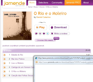
Music - The non-diegetic music for our thriller took us quite a while to find. This is because we wanted music which was suitable for our thriller by having a slightly mysterious and scary soundtrack. This was also time consuming because we had to find music which was not copyrighted so that we could use it in our thriller. This involved us looking at loads of websites however some didn't allow you to download music for free and others just did not have a soundtrack which we thought suited our thriller. Eventually we came across the website http://www.jamendo.com/en/, this website allowed us to download royalty free music for free. Then once on the website we typed "soundtrack" in the search bar to see if there were any suitable ones for our thriller. After browsing the website for some time we eventually decided on a piece called 'Lia e o Moleiro' on the album 'O Rio e o Moleiro' by Daniel Catarino. We decided on this track because we thought that it suited our thriller because the music builds up and creates tension and this is also shown in our thriller as it slowly builds up to the death by the victim walking towards the house and the villain making a cup of coffee and it is foreshadowing the death which is about to happen. We then had to download this piece of music from the website, however this was very simple to do.
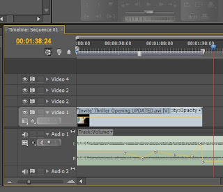
The next part involved editing the music we had downloaded into our thriller. To do this we used the software 'Adobe Premiere'. To put the music into the opening sequence of our thriller was fairly simple. However the hardest part of editing the music was when we decreased and increased the volume of the music at certain stages in our thriller. We did this where there is dialogue, the music decreases in volume when the dialogue begins and increases when the dialogue finishes. We did this so that it was easier for the audience to hear the dialogue. Then Jonathan increased the volume of the music at end when the title 'Invite' appears and then crescendos in to silence, which gives the thriller an eerie and mysterious atmosphere.
No comments:
Post a Comment